North Atlantic Communications
NAC (North Atlantic Communications) is a concept brand of an encrypted mobile phone for sale on the US market.
I was involved in a competition to develop a concept logotype and landing page for a future product.
Target audience:
– Corporate executives and high ranking government officials, 35-55 YO, male
– Banking and financial services
– Law and legal services
– Law enforcement/police
– Government
Main concerns:
– Security – preventing valuable information from leaking
– Privacy – concealing private matters
Key selling points:
– Strong encryption
– No malware
– No tracking
Website purpose:
– To serve as a business card, simple one page design
Client:
Secure Group Lab
My work:
Creative & Art Direction, Brand Strategy, Logo Design, Web Design, Graphic Design,
Branding, Photo Manipulation

Mood Board

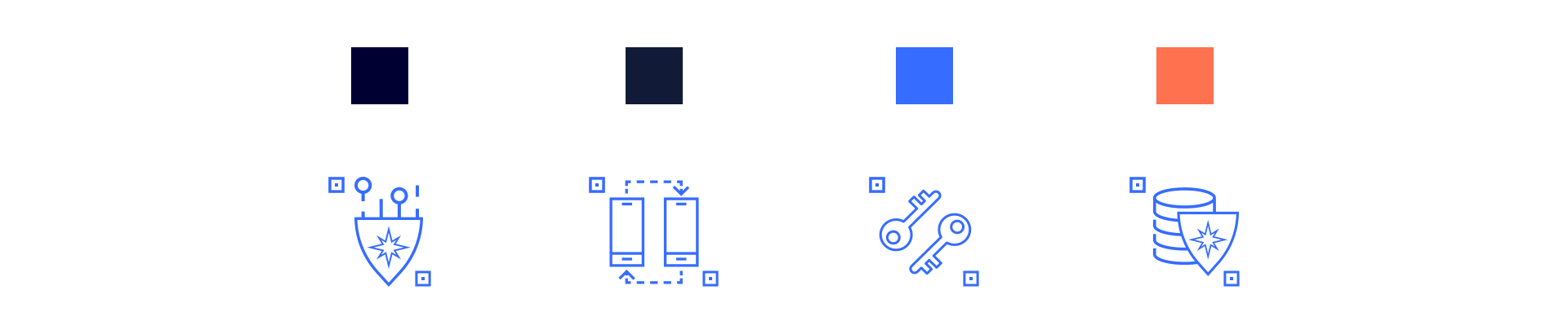
Used color
Blue is strongly associated with tranquility and calmness. Blue is used to promote products and services related to Technical innovations, Financial services, Law and legal services, Security, etc.
It is linked to consciousness and intellect. Blue is a masculine color; according to studies, it is highly accepted among males.
Dark blue is associated with depth, expertise, and stability; it is a preferred color for corporate America which is the target group of the brand.
It represents knowledge, power, integrity, and seriousness.

Logo concept #1
Typographic logo with custom-made font, representing the idea of encryption. The missing elements make every symbol change its graphic shape thus creating the sense of a cipher. This simple and minimalist approach uses the white space to illustrate the secured pieces of information by decoding its readability while still keeping its clarity.
Inspiration:
– encrypted typography
– custom font
– simple design

Logo Concept #2
This logo proposal is inspired by the most powerful visual association of defense and security –the shield. This icon represents protection and stability. A detail to be considered on the shield is the Northern star - a landmark and a trustful guidance, that helps determine direction and lead toward a purposeful destination. This is an important meaningful reference as digital information needs to have a secure guidance and data protection.
Behind the shield unveils a graphic illustration of a wave in an encrypted style of squares. The wave is the symbol of conveying digital information (here is why it’s called “surfing the internet”).
Both the wave and the Northern star represent the ocean and create a strong reference to the North Atlantic, turning those symbols into brand indicators.
Inspiration:
– wave
– encryption
– shield
– Northern star
– QR code

Logo concept #3
Logotype of the abbreviation of the company’s name. This approach illustrates the process of encryption and decryption, securing the information and at the same time keeping its integrity.
The font is customized Helvetica which is tremendously precise and represents stability and solid structure.
Inspiration:
– perfocard
– transition between encryption and decryption
– damping wave
– customized Helvetica

Product Landing Page
Upon entering the landing page, a pop up window appears for quick interaction with the users. They have to “unlock” the page by clicking a “decryption” button in order the information to be revealed. Once done, the page transforms from pixels to clear visuals with animation
and thus we remind users again that our main concern is their data safety.

The landing page has modern simplistic design, colored in dark blue shades. Its smooth navigation quickly makes the user familiar with the product's main functionalities and features. The vivid color accent gives clear directions on the menu bar and illustrates the key points on the website. By using smartphone mock-ups and graphic elements, the product becomes more real and its idea get illustrated more easily to the user, so they can comprehend the information and have a pleasant digital journey.